Part Two: How an Update Can Strengthen Your Brand
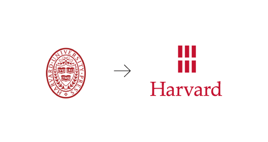
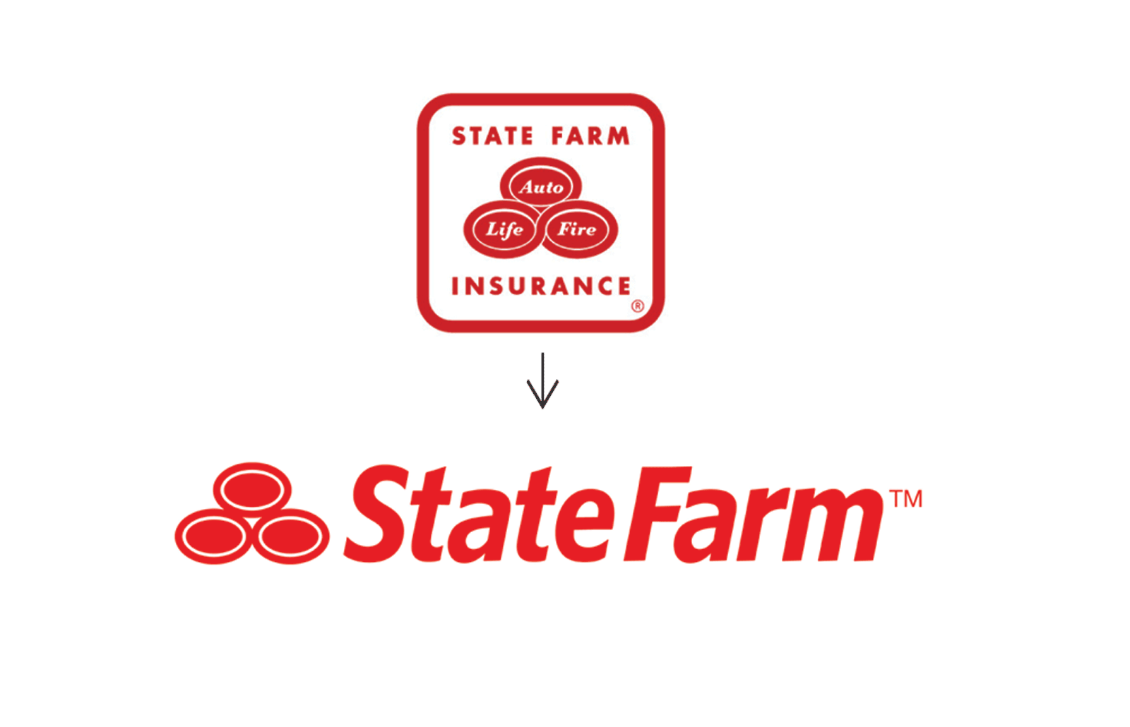
In Part One of The Logo “Refresh” we discussed why changing a brand must be handled with care and looked at circumstances when it’s ok to update a logo. Two examples of when a logo update succeeded in creating a new, more polished look are Harvard University Press and State Farm, both designed by the talented team at Chermayeff & Geismar & Haviv.
But, proceed carefully.
If you are simply updating an outdated logo and not embarking on an overall re-brand, it’s important to keep as much of the original logo as possible, so as not to confuse your customers and to preserve existing brand strength.
Four guidelines to keep in mind when evaluating a potential design update are:
1. Shape. Maintain the original logo’s overall shape, or the shape of its dominant elements, as much as possible.
2. Form. Maintain the integrity of the original logo’s dominant elements (very important for subconscious brand recognition) but pair down or remove any clutter or unnecessary elements.
3. Typeface. Maintain the general orientation and layout of the existing typeface, typically the company name, but update it to a more modern or legible font.
4. Color. Maintain the original color scheme but update any outdated colors to a more modern shade and remove any excessive or superfluous colors.
Below are several examples of smaller, local companies who successfully updated their logo by relying on these four guidelines.

In this example, we maintained the logo's general square shape, the color scheme, and the logo's dominant element (the initials), but we updated the typeface to a more professional choice and removed the gradient to improve reproducibility.

The original logo needed a major update to improve legibility and reproducibility, but the dominant element (the orange oars) was preserved.

The logo was pulled out of the box, the gradient was removed, and the typeface updated to match the organization's new design direction.

The original logo was becoming very hard to read and reproduce. The new design simplifies the tree, opens up the design, and gives the company name more prominence.
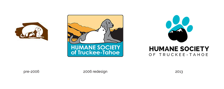
Alternately, there is a place for an entirely new branding strategy, and with it, a new logo (see Part One to read why). Below are two examples of logos that have evolved over time while maintaining brand strength.

For more information on how POND Collective can help improve your brand strength through logo design, call (530) 587-5625